


In this post I want to describe how to create a logo and what thoughts went into making it. In this case, the logo is for a university project called Ohua. The developers if this project contacted me, asking if it was possible for me to create a logo for them. Of course I would, because this is also a great exercise. Why? Because my client, in this case a nice postdoc called Sebastian, has (in his own words) no idea how it could be represented. This is an awesome challenge, and gives you the possibility to think freely. There were no restrictions, other than that the logo has to work as a file icon.
What I want to write about is the process that goes behind all of that. It explores the possibilities on how we can represent meaning to those who know the context and also be visually pleasing. This is to confirm, that the design process is never linear, but mostly iterations of improvements.
The Setup
First of all, I set myself some goals for the project to be called successful:
A) The logo has to work in a single color
B) Simple and big shapes, and it can ve recognized on a 32x32 px resolution
C) Represent the meaning behind the project
Getting Started
So that was it. Now at this stage, I set up an interview with the client. This is the most helpful and important part. You need to understand what the product or project is, what it represents, and in the best case also know in detail how it works. So we sat down in a nice cafe and we started to talk. Being outside of his knowledge-bubble this gave me the advantage point to just as the following question: “Can you explain to me what you are doing and how it works, for someone who does not know only basic coding?”
So that is what he did. This is helpful, because in explaining things in a simplified way urges you to use comparisons. We do this all the time without recognizing it. So here is roughly what he said: (written down from my memory, just the important parts)
“Ohua is a tool that encapsulates your code. You just write your code in a linear fashion, and it encases it to make it work in parallel. The main advantage is that you do not have to worry how to use threads or locks or anything like that. It just works.”
That sounded like an awesome idea! So what did I take away from this interview? The key points were: “capsule, encasing, parallel”.
So the next part to brainstorm ideas. How can we represent all of this?
The following images were some of the over 50 different variations that I tried:
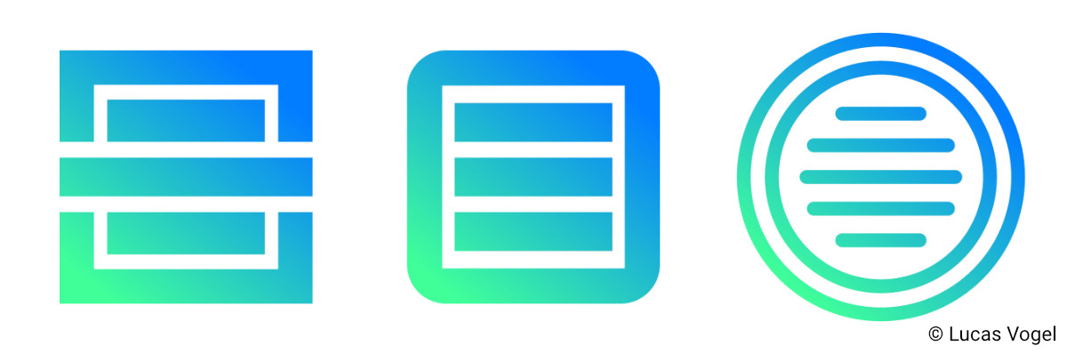
The idea of the capsule looked really promising, so I explored it further:
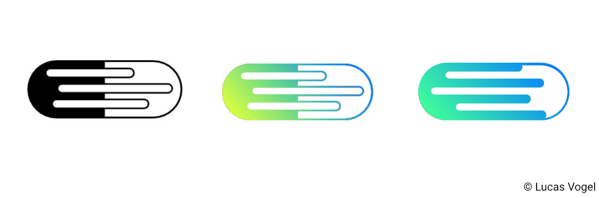
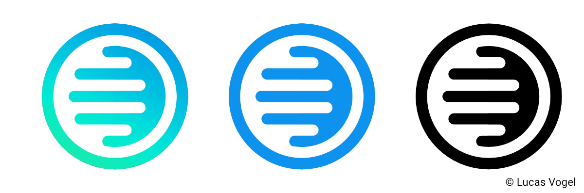
So what you can see is the idea of a literal capsule, with parallel lines that should represent fingers that interlock, and also the code that has been written.
Just as a note: the colors were just temporary and just to show that it could work. We did change them later. At our next Meeting, I showed 3 of the most promising logo ideas, and for each one another 2-3 variations. We quickly agreed, that the round version with the parallel lines was the one to go. The nice thing with that is, that we can explore the idea of using part of this logo as a logo with text. In this example, the logo has two versions: Only the round logo, or the logo with text. We also discussed to add more lines, to create correct hands (with 5 fingers) and to better represent the lines of code. This worked out rather nicely:
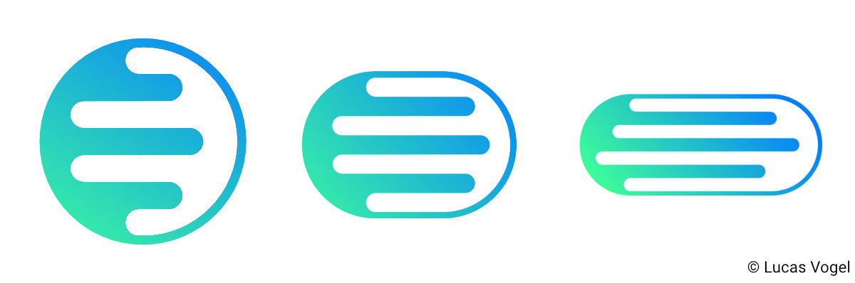
And then we tried it with text:
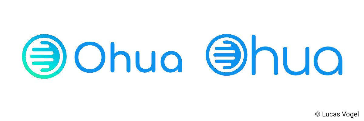 You can see, the versions with more lines and as part of the text were the best ones.
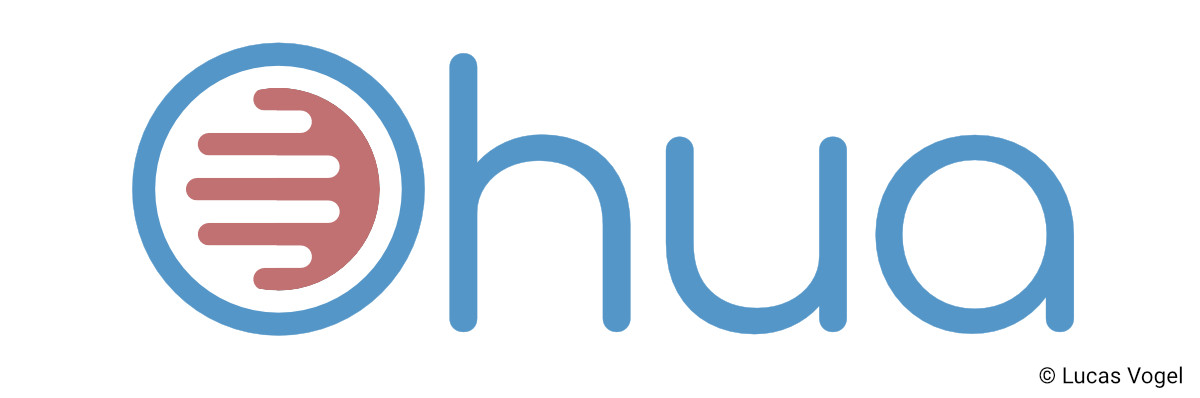
Lastly, we discussed color. The process was similar to above. We looked at what looked nice and what they could use. However, this phase was quite time consuming and not that exciting, so I will skip it here. We ended up with 3 color variations: one white, one black and one with two colors. This was not quite to my exact taste, however, my client ordered me to use this color combo, as he and his coworkers liked it the most. So here is the final result:
So that is it! The project was a success, and my client was happy. I hope you liked my explanation behind creating a logo and how to start, when you had no restrictions by the client.
The Aftermath
This project was back in 2018, but I just now got time to write about it. Most of the times, you look back and see things, that you didn’t see back then and want to change them. Maybe in the future I will find more things that I don’t like about it, but for now, I think it worked out quite well. The only thing I want to change is the kerning of the logo with text. It may not be so bad, but you cannot un-see it when I tell you, that the distance of the “O” and the “h” is smaller than the distance between the “h” and the “u”.
However, the logo with text was never really used by my client, so this is fine. To summarize, I have created a logo for a complex project, with basically no restrictions, and tried to explain my workflow on how I approach a job like this.